There are a couple of nice “folded” text effect tutorials out there, but this tutorial takes a slightly different approach to the concept. We’ll be creating a folded text, and a simple pattern to make it look like it’s cut out from a notebook. The letter “O” will be used to illustrate the concept, as it needs a little bit extra work done to it.
Notes:
* the software used in this tutorial is Adobe Photoshop CS5 Extended
* the size of the final result image is 1024 * 768
* you might want to check the Basix Page to see some useful topics on dealing with Photoshop basics, such as loading palettes and some shortcuts.
Resources:
Step 1:
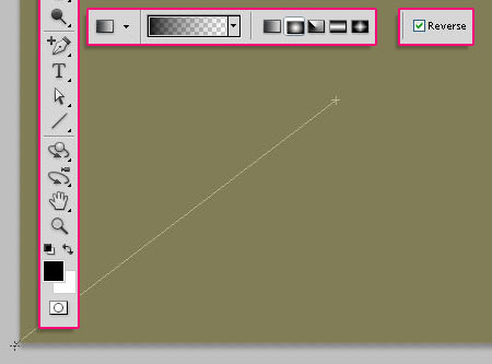
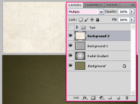
- Fill the Background with the color #817d57, then, go back to the default colors for the Foreground (Black) and the Background (White). Create a new layer and call it “Radial Gradient”. Choose the “Foreground to Transparent” gradient, the “Radial” one, and check the “Reverse” box on the far right.
- Starting from the center of the background, drag the gradient to one of the corners.
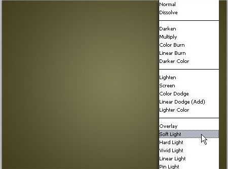
- Change the “Radial Gradient” layer Blend Mode to Soft Light.
Step 2:
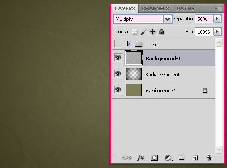
Now, we will add some texture. First, drag and drop, or duplicate the Paper Texture on top of your Background layer, and rename the layer to “Background-1″.
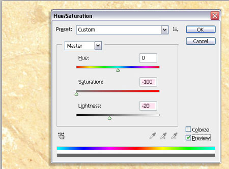
- Go to Image -> Adjustments ->Hue/Saturation, change the Saturation value to -100, and the Lightness value to -20.
- Change the “Background-1″ layer Blend Mode to Multiply, and the Opacity to 50%.
Step 3:
Add the Grungy paper texture on top of all layers, rename the layer to “Background-2″, and just change the Blend Mode to Multiply.
Step 3:
Now, we will create the notebook lines we’ll be using later on in this tutorial. So go ahead and create a 300 x 300px new document. Fill the background with the color#f7f4fb.
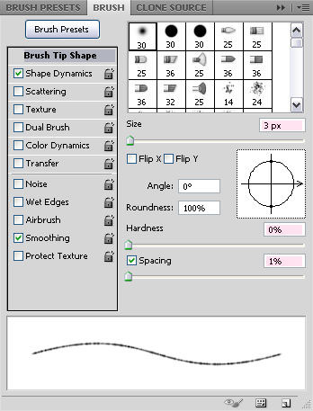
- Set the Foreground color to #d0d5de. Choose a soft brush, and from Window -> Brush, edit the values as below:
- Under the Brush Tip Shape tab, change the Size to 3px, the Hardness to 0, and theSpacing to 1%.
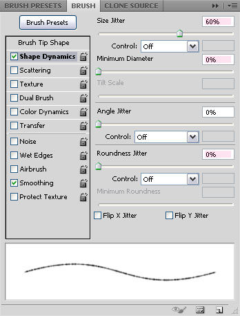
- Under the Shape Dynamics tab, change the Size Jitter to 60%, the Minimum Diameterto 0%, and the Roundness Jitter to 0% as well.
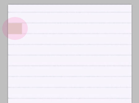
The settings above will give the illusion of the notebook lines. So now, we are going to create a new layer, and draw the lines.
A simple and quick trick I use to keep the same vertical distance between lines is creating a square or rectangle shape, and move it downwards after drawing each line.
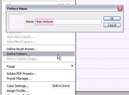
- Once you’re done drawing the lines, go to Edit -> Define Pattern, and type the name of your pattern in the dialog box.
Step 4:
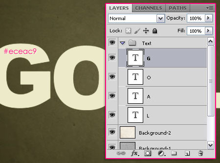
Back to our original document, we will now start working with our text. Create the text you want, each letter on a separate layer, using the color #eceac9. Group the letters and call the group “Text”.
Through the following steps, make sure you create a new copy/duplicate of each character, and place it in a separate new group that has the letter’s name, because we are going to add multiple layers, and we need to keep our work organized.
Step 5:
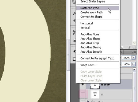
So now that the current letter you’re working on is duplicated and put in its own group, rotate it or move it the way you want, then, create another duplicate of the layer, right click on the duplicated layer -> Rasterize Type. Make sure you remove the “eye” to the left of the original unrasterized layer so that it is invisible.
Step 6:
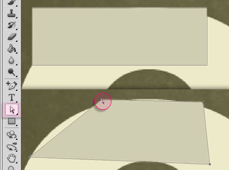
Now, we’ll create the fold. Using the Rectangle shape tool, draw a rectangle above the latter. The fold will make an edge from one point of the letter to another, and to create that edge, we will use the Direct Selection Tool to select the Rectangle corners and move them.
Step 7:
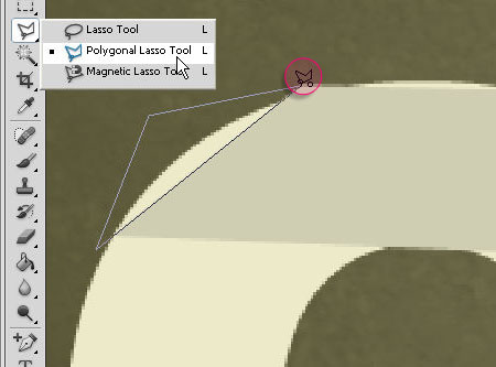
- When you’re done creating the edge, it’s time to delete the extra parts of the letter that are not supposed to appear after the letter is folded the way it is. Select the rasterized letter layer, and using the Polygonal Lasso Tool select those parts and delete them.
- The extra work needed for the “O” letter is a simple logical thing, as the fold ends, it is illogical to have the letter seem continuous underneath it. So we’re going to remove a small part to make it look more real, also using the Polygonal Lasso Tool.
Step 8:
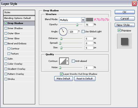
- Double click on the letter layer, and apply a Drop Shadow using the color #7b7b7b.
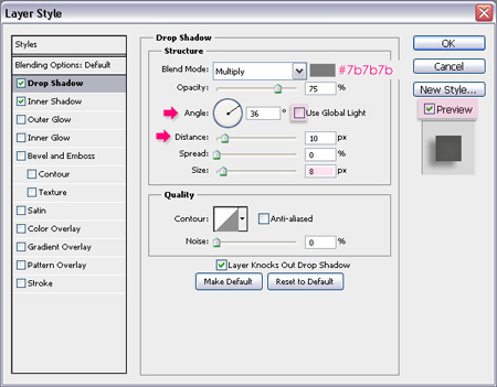
- Double click on the fold layer, and apply a Drop Shadow using the same color #7b7b7b, and change the Size to 8px.
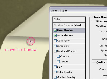
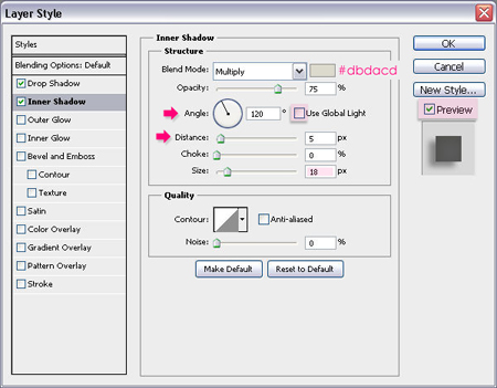
Un-check the Use Global Light box, so that now you’ll change the Angle and Distancevalues by moving the shadow on the layer directly. To be able to do this you must make sure the Preview is checked.
- Apply an Inner Shadow using the color #dbdacd, and change the Size to 18px.
Move the shadow exactly the same way, so that it goes with the fold from the left.
Step 9:
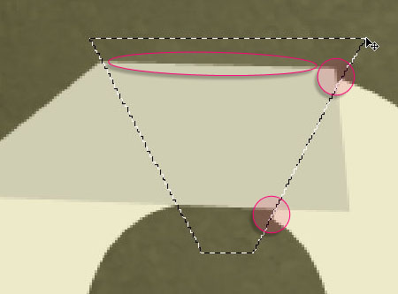
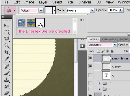
Create a new layer above the letter layer and under the fold layer, call it “Lines – letter”. Using the Elliptical Marquee Tool, draw a big circle around the letter, and make it bigger that the letter.
From the Paint Bucket Tool options, choose the Pattern as the source for fill area, then choose the pattern we’ve just created and defined. Fill the circle with the pattern, and change the layer Blend Mode to Luminosity.
Step 10:
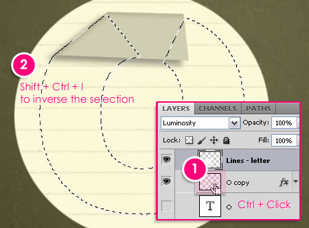
Hold the Ctrl key, and click on the letter layer thumbnail to create a selection of the letter.
Go to Select -> Inverse or Shift + Ctrl + I to inverse the selection, and delete the extra fill.
Step 11:
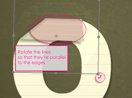
Create a new layer above the fold layer, rename it to “Lines – fold”. Draw a big circle again and fill it with the pattern. Go to Select -> Deselect, or Ctrl + D. The reason why we draw the big circle is that we can rotate it to be parallel to the letter or the fold later on (the same angle).
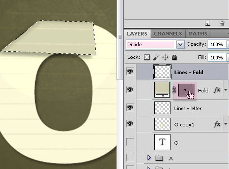
Change the “Lines – fold” layer Blend Mode to Divide, now you can see the fold, so go ahead and rotate the pattern.
Ctrl click on the fold shape thumbnail to create a selection, inverse it, and delete the extra parts.
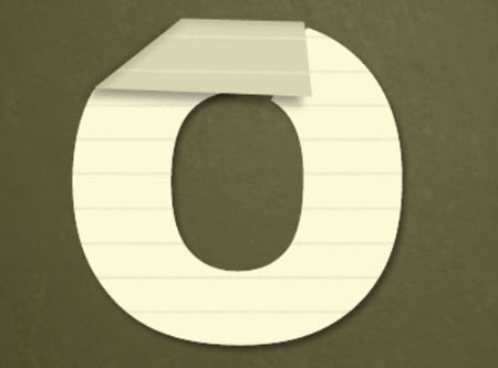
This is what you’ll get
Step 12:
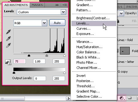
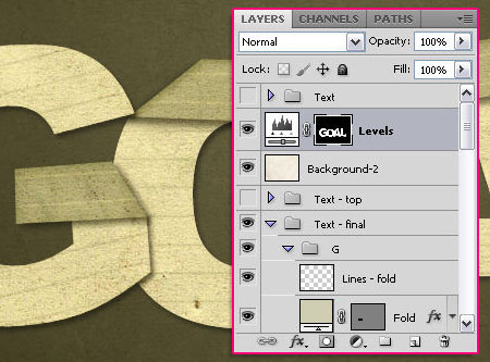
When you repeat the same steps for all the letters, we are going to select all the letter layers and fold layers, using Ctrl + click on the thumbnail, along with the Shift key to addto the selection.
Add a Levels adjustment layer, change the Shadows value to +75.
Finally, move the “Background-2″ layer to be on top of all the other layers but under the Levels adjustment layer .